Standing out in California’s competitive local market isn’t just about having a great product. It’s about being seen, remembered, and trusted before a customer even walks through your door. Consistent branding across signage, your website, and marketing materials is essential for building recognition and trust. Whether you’re running a shop in Lemoore, a food truck in Fresno, or a service business in Visalia, the right branding strategy can drive real foot traffic, boost sales, and make your business the one people remember. This article gives you practical, proven ideas to make that happen.
Table of Contents
- Framework for effective branding: Criteria every business should use
- Standout signage design: Color, fonts, and simplicity
- Smart placement and accessibility: Making your signs work harder
- Beyond signs: Branding ideas for shirts, decals, and promo items
- Our take: What really drives local branding success in California
- Get expert help with custom branding and signage
- Frequently asked questions
Key Takeaways
| Point | Details |
|---|---|
| Consistency builds trust | Unified branding across all materials strengthens recognition and credibility. |
| Readable design converts | Signage with clear colors and fonts can drive more walk-ins and sales. |
| Strategic placement matters | Locating signs at eye level and ensuring visibility maximizes their impact. |
| Update every five years | Replacing faded signage maintains your brand’s freshness and ROI. |
| Multichannel branding wins | Shirts, decals, and promo items expand your reach beyond storefront signage. |
Framework for effective branding: Criteria every business should use
Before you print a single banner or order a batch of branded shirts, you need a solid foundation. Branding that works starts with clarity: Who are you? Who are you serving? What do you want people to feel when they see your name?
Start by defining your core values and target audience. If you’re a family-owned hardware store, your brand should feel approachable and reliable. If you’re a trendy coffee shop, your visuals should feel fresh and modern. These values then drive every visual decision you make. Your logo, colors, and fonts aren’t just aesthetic choices. They’re communication tools.
Visual consistency is the backbone of any strong brand. Here’s what needs to stay consistent across every touchpoint:
- Logo: Use the same version everywhere, from your storefront sign to your t-shirts to your invoices. Logo design essentials can help you understand how to build something that scales well across formats.
- Color palette: Pick two to three primary brand colors and stick with them. Color recognition alone can boost brand awareness significantly.
- Typography: Use one or two fonts consistently. Mixing too many fonts makes your brand look scattered and unprofessional.
- Tone: Whether you’re casual and fun or polished and professional, keep that voice the same whether you’re writing a social post or labeling a product.
Think of small business coffee brands as a great example. The ones that grow a loyal local following do so by presenting a unified look and feel at every interaction, from the shop sign to the cup sleeve to the branded apron.
Pro Tip: Walk outside your own business and look at it like a stranger would. Is your signage still sharp and readable? Does it match your website and social media? If it’s been more than five years since your last signage refresh, it’s time to take a hard look. Faded, outdated signs send the wrong message before you even say hello.
Standout signage design: Color, fonts, and simplicity
Now that you have your criteria locked in, let’s focus on how to create signage that truly pops. The goal is simple: someone driving by at 30 miles per hour should be able to read and remember your sign. That’s a short window, so every design decision matters.
Here’s a practical process for creating high-impact signage:
- Choose high-contrast color combinations. Black on white, white on navy, yellow on black. These combinations maximize readability from a distance, even under the intense Central Valley sun.
- Pick bold, legible fonts. Avoid thin script fonts for your primary message. Sans-serif fonts like bold Helvetica or Impact read well at distance and in varying light conditions.
- Limit your message. A good sign communicates one thing quickly. Your business name, what you do, and maybe a call to action. That’s it. Every word you add reduces readability.
- Use negative space intentionally. Crowded signs are hard to read. Give your text and graphics room to breathe. White space isn’t wasted space.
- Consider your background environment. A sign that looks great on screen can disappear against a busy brick wall or a bright sky. Test your design in context before committing to production.
“Signage design must prioritize readability with high-contrast colors, bold fonts, and simplicity to communicate effectively in seconds.”
Window graphics and creative decal ideas are another powerful tool for local businesses. A well-designed window decal can turn dead glass space into an attention-grabbing brand moment without a major investment.
Pro Tip: If your business is open after dark, consider illuminated signage options like LED-lit channel letters or backlit panels. Your sign works for you 24 hours a day, not just during business hours. That’s a lot of free advertising time.
Smart placement and accessibility: Making your signs work harder
A beautifully designed sign in the wrong location is a missed opportunity. Placement is just as important as design. Think about where your customers are coming from, how fast they’re moving, and what obstacles might block their view.
Strategic placement at eye level, considering day and night visibility and local traffic patterns, maximizes impact. Walk your property at different times of day and from different angles. Check for trees, parked cars, utility poles, or competing signage that might obstruct your sign’s view. You might be surprised how much your current placement is costing you in visibility.
Key placement principles to follow:
- Mount storefront signs at eye level or just above, so they’re in the natural sightline of pedestrians and drivers.
- Use multiple signs for large properties. One sign near the road for drivers and one near the entrance for pedestrians gives you better coverage.
- Angle directional signs toward approaching traffic so people have enough time to react and turn.
- Consider lighting. Even a great sign becomes invisible at night without proper illumination.
Accessibility is another area where small businesses often fall short. ADA-compliant signage requires high-contrast colors, large fonts, and tactile or Braille elements for interior signs. This isn’t just a legal requirement. It’s a signal to your community that your business is welcoming to everyone.
Here’s how signage upgrades have translated into measurable results for real businesses:
| Signage upgrade | Average sales increase | Foot traffic change |
|---|---|---|
| New illuminated exterior sign | 15 to 22% | Up 18% |
| Window graphics added | 10 to 15% | Up 12% |
| Vehicle wrap or decal | 12 to 20% | Varies by route |
| Directional signage improved | 8 to 12% | Up 9% |
After you install new signage, track your results. Compare foot traffic numbers and sales data from the month before and the month after. This is how you measure ROI (return on investment) and justify future branding spending. Your sign and print solutions should be treated as a long-term business investment, not a one-time cost.
Want to see how this applies specifically to agricultural and farm businesses in the region? Branding with decals offers a targeted look at using printed decals for outdoor brand presence that holds up in tough conditions.
Beyond signs: Branding ideas for shirts, decals, and promo items
Signage is just one touchpoint. Here’s how apparel, decals, and promo items can extend your brand well beyond your storefront.

Signage upgrades yield 10 to 22% sales increases on average. One coffee shop saw a 22% increase in walk-ins after installing a new illuminated sign. Another cafe experienced a 22% daily sales boost from similar upgrades. The data is clear: visual branding pays off. And when you extend that same branded look to shirts, hats, vehicle decals, and promo items, you multiply those touchpoints exponentially.
Here’s a quick comparison of popular branding products for small businesses:
| Product | Typical cost | Brand impact | Best use case |
|---|---|---|---|
| Custom t-shirts | Low to moderate | High, walking billboard | Staff uniforms, events, giveaways |
| Window decals | Low | High, constant visibility | Storefronts, retail spaces |
| Vehicle decals/wraps | Moderate to high | Very high, mobile billboard | Service vehicles, delivery trucks |
| Campaign/event signs | Low | Moderate, targeted reach | Sales, seasonal promotions |
| Branded promo items | Low per unit | Moderate, lasting recall | Trade shows, customer gifts |
Here are some specific ways to put these products to work for your business:
- Branded staff shirts and hats instantly create a professional look that builds customer trust. When your team wears your logo, they become walking advertisements throughout town.
- Vehicle decals and wraps are some of the most cost-effective branding tools available. A truck with your logo driving around Hanford or Corcoran reaches thousands of eyes daily with zero ongoing ad spend.
- Window decals and campaign signs are great for seasonal promotions, new product launches, or local events. They’re fast to produce and easy to swap out.
- Promotional items like branded pens, bags, or water bottles keep your name in front of customers long after their visit. People use useful items, which means your brand gets repeated exposure.
The key is making sure all of these items carry your consistent visual identity. Custom t-shirt printing for local teams and businesses is one of the most accessible starting points. And while AI-generated logo tools might seem tempting for a quick shortcut, understanding the limitations of AI logos can save you from a branding mistake that’s costly to fix later.
Our take: What really drives local branding success in California
Here’s our honest perspective after working with hundreds of small businesses across the Central Valley: the businesses that build the strongest local brands aren’t the ones spending the most money. They’re the ones being the most consistent and intentional.
We see it all the time. A business invests in a beautiful interior, a slick website, and active social media, but then has a sun-bleached, unreadable sign out front that contradicts everything else they’re trying to communicate. That mismatch costs them. First impressions matter, and your physical signage is often the very first impression a potential customer gets.
Digital advertising gets a lot of attention, and it has its place. But signage offers 20-50x ROI over its lifespan compared to digital ads. A well-made outdoor sign works for you around the clock, every day, for years. Digital ads stop the moment you stop paying. That’s a fundamentally different economic model, and local businesses should think carefully about where their branding dollars are going.
Another truth we’ve learned: neglected touchpoints hurt your brand silently. An old, inconsistent vehicle decal. A staff shirt in a slightly different shade of your brand color. A banner printed three years ago with an outdated phone number. These small details add up to a fuzzy, uncertain impression in the customer’s mind.
Our advice is to do a brand audit once a year. Walk through every physical place your brand appears, from your vehicles to your storefront to your team’s apparel. Does everything match? Does everything still look sharp? Creative decals for Central Valley businesses are one of the fastest ways to refresh a key touchpoint without a major overhaul.
Finally, don’t underestimate the power of local pride. Customers in Kings County and across the Central Valley genuinely want to support businesses that feel like they belong here. Branding that reflects your community roots, whether that’s through imagery, messaging, or even just showing up at local events with branded gear, creates a connection that no digital campaign can replicate.
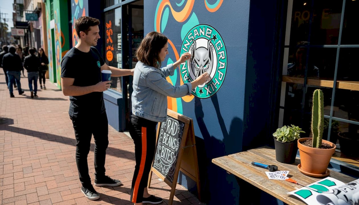
Get expert help with custom branding and signage
Your branding vision deserves expert execution, and that’s exactly what we offer at Plain Insane Graphix. We’re based right here in Lemoore, California, and we understand the specific needs of Central Valley businesses, from heat-resistant materials to fast turnaround times for seasonal campaigns.

Whether you need campaign signs for an upcoming promotion, custom embroidery solutions for your team’s apparel, or a full suite of sign and print services to refresh your brand across every touchpoint, we’ve got you covered. We’ve been voted the best print shop in Kings County, and we back that up with quality products, competitive pricing, and the kind of local expertise that national print chains simply can’t offer. Come see us, call us, or start your order online today.
Frequently asked questions
How often should small businesses update their signage?
Signage should be refreshed every five years or sooner if it looks faded or outdated, since worn signage undermines customer trust and reduces your brand’s impact.
What design features make signage ADA-compliant?
ADA-compliant signs require high-contrast colors, large readable fonts, and tactile or Braille elements for interior locations, making your space more inclusive and legally compliant.
How can I measure ROI from branding investments?
Track foot traffic counts and sales totals before and after installing new signage or branded materials, then compare the numbers to calculate your return on branding investment.
Should branding extend beyond signage to shirts and decals?
Absolutely. Shirts, vehicle decals, and promo items each create additional brand impressions that reinforce recognition and keep your business top of mind across multiple touchpoints in your community.
Leave a Reply